

Originally published June 09th, 2009
by Peter Sheerin
I have been using PowerPoint since sometime shortly after I began my magazine career back the early 1990s, continually learning and trying new things. But here, nearly a decade into the 21st Century, I am amazed at how poorly people use the tool, and in particular, how poorly designed many templates are. Which, of course, is a direct result of how poorly designed PowerPoint is.
Disclaimer: This article is based on PowerPoint 2003, so is a release behind, but it is still highly relevant, because many corporations are still using Office 2003, including the American Red Cross, whose PowerPoint templates led me to create this tutorial.
In particular, there seems to be much confusion about how to properly create a PowerPoint template that has color schemes, font selection, and backgrounds pre-applied in such a way that inserting a new slide or applying a slide design has the desired effect, without forcing presenters to copy and paste slides or delete extra content to make new slides with the proper design. Small wonder, since it confounded even this seasoned geek.
The Structure of PowerPoint
All of the corporate PowerPoint templates I’ve ever looked at were either missing or mis-using a whole slew of key features, with the result being that anyone using the template was forced to make up much of their own formatting, or tediously copy and paste slides to ensure the visual appearance remained consistent.
I once slimmed down an associate publisher’s 35 MB (or was it twice that?) PowerPoint deck into a 2 MB masterpiece, just by moving the fancy slide design from content copied onto each slide into the Slide Master (and removing more than a few other bits of fluff).
I bet your presentations aren’t quite that bad, but I also bet that they’re not as good as they should be. I’ll show you the right way to create and format PowerPoint templates.
Worst-Case Scenario
I need to start this section by emphasizing that I’m not trying to bash the American Red Cross’s national graphics team. It’s just that their template happens to be mis-using just about every key formatting feature, and so makes a perfect example to build this tutorial around.
First and foremost, the template I found on the National site wasn’t saved as a template. If you go to the trouble of creating a template, please save it with the .POT extension, so it can be placed in Office’s Template directory and made available whenever someone selects File > New… from within PowerPoint.
Second, the Red Cross cares deeply about branding, colors, fonts, and bullet shapes, yet none of the official corporate fonts, colors, or other design guidelines were applied to the template. And the colors that were applied were done so by applying a fill to text boxes, instead of being applied to the background and with PowerPoint’s Color Scheme feature. Aside from resulting in slides that don’t match the corporate standards, this makes the template difficult to modify.
Third, the template had four blank slides, and five Slide Masters. Out of the masters, there was no Title Master, one was never used, and two were duplicates of each other, save for a sample image and bulleted list. This misuse of Slide Masters is the single biggest problem with the existing template.
Lastly, the existing template uses raster versions of the Red Cross logo, which are blurry and contribute to the nearly-empty“template†being almost 3½ MB in size.
It’s In There
PowerPoint has many features that let you, the template designer, pre-define how slides inserted by PowerPoint neophytes will look. The two most important are the Color Schemes and the Slide Master/Title Master pair. These must be designed first—and together—before you start adding anything fancy to your design.
Once you finish that, you will be able to specify fonts, placeholder areas, background fills, bullets, slide transitions, and animation schemes that will work well together.
Step-by-Step: Making a Superior Design Template
Because many of the PowerPoint formatting features interact with each other, the order in which you design the template is important. Stick with the order I present here until you understand how all the pieces come together. If you decide to deviate, use this key test to make sure your scheme works properly: Select any one particular slide in a presentation you’ve built with the new template, and (re)apply any one of the color schemes that you designed. If everything looks as you expected, great. If not, you will need to go back and change what colors you use for the slide background, background pattern or fills, and the coloring in any graphical elements in your Slide and Title Masters.
Start with the blank, default presentation
Before you can make a good template, you have to throw away everything you or others have done previously to “enhance†the PowerPoint template. First, go find the folder PowerPoint keeps its templates in. You can use File > Save As… and then under Save as Type select Design Template (.pot) and pull down the Save In listbox to find the path. Navigate to that folder in Windows Explorer.
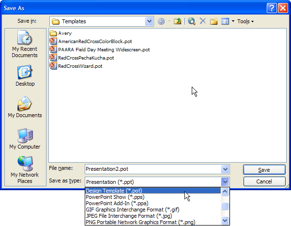
PowerPoint Save As dialog box
Exit PowerPoint. Now rename blank.pot to something else. Any name will work; this is a magic file name and is the only one PowerPoint uses to redefine its internal default slide design.
Don’t panic! I’m not implying you can’t reuse anything from your existing designs, just that you have to start fresh. We will cut and paste some things later on, but for now, we must cleanse the soul.
Restart PowerPoint. You will be rewarded with a blank presentation consisting of a title slide, a slide master, no title master, and the default font set to Arial. Fantastic! You are assured that everything in PowerPoint is set to the defaults.
Insert a blank content slide by pressing CTRL + M, then save this as a Design Template (.pot).
Make the Masters
Insert a normal slide with Insert > New Slide (or CTRL+M), so that you will be able to see the changes you make to the Slide Master and Title Master.
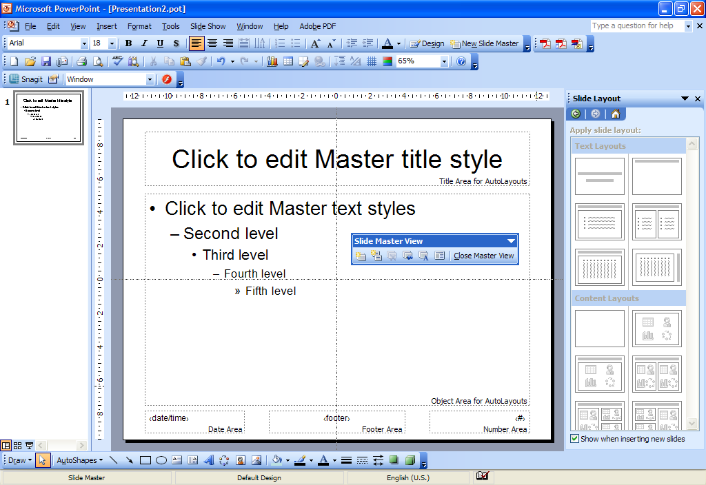
Slide Master view
From the menu, select View > Master > Slide Master. Notice the strange dichotomy, that the blank presentation has just a title slide, but the Master you see is a Slide Master, not a Title Master. Ignore this fact and on the Slide Master View toolbar click the second button from the left, Insert New Title Master.
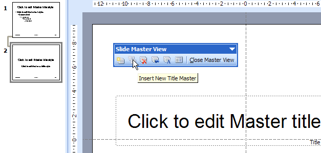
Insert Title Master
The Font of Youth
While still viewing the slide master, change the font for the Title and Object areas. Highlight all the text in one, select the desired font from the formatting toolbar, and then repeat on the other area. Don’t touch the font size while you have the entire bulleted list selected, or you will set all the indented levels to the same size (probably not what you want). If your chosen font is a Type 1 or OpenType font, you may find multiple weights (regular, medium, bold, etc.) of the font available. If this is indeed the case, use these instead of using the Bold button on the formatting toolbar—the resulting appearance will be what the font designer (and your brand identiy guru) intended.
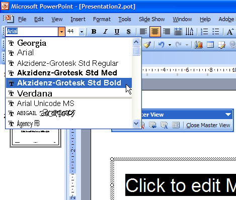
When selecting the font, watch to see if there are multiple variants of the font you want, covering attributes such as bold or itallic. If these variants exist, you need to select them from the font-selection list, instead of applying the attributes with the Bold or Itallic toolbar buttons. Using the toolbar buttons will simply thicken or tilt these fonts, while selecting the desired weight will display as the font designer intended. This is likely to be the case with Adobe Type 1 and OpenType fonts.
Notice that when you view the Title Master, the fonts you applied to the Slide Master have also been applied to the Title and Subtitle areas. If you change the fonts in the Title Master first, you will have to reapply the formatting to the Slide Master. This may be counter-intuitive, but is consistent with the hierarchy implied by the Title Master appearing below and being connected by a line to the Slide Master. You may, however, want to specify a different size, weight, or font for the Subtitle area, which appears only on the Title Master.
Bullet Foundry
There are two ways to format bulleted lists to your liking. Both must be done while viewing the Slide Master.
The first is to select the entire bulleted list in the Object Area, and then select Format > Bullets and Numbering… from the main menu. This will apply the same bullet character or picture to all levels, automatically sized to match each level’s text size.
The second method is to select each indented level, one at a time, and then use the same Format > Bullets and Numbering… menu item.
In either case, don’t forget that you can play around with lots of things if you click the Customize… button, including using characters from other fonts. Try Wingdings, Symbol, Arial Unicode MS, and whichever font you’re already using for the list. In particular, explore the following Unicode Subsets of each of the above fonts:
- General Punctuation
- Arrows
- Mathematical Operators
- Miscellaneous Technical
- Geometric Shapes
- Miscellaneous Shapes
The Red Cross style guide specifies a sequence of a filled circle, then an Em or En dash, and finally an open circle, so I selected Black Circle (9679) â—, En Dash (8211) –, and (9675) â—‹ as the bullet characters, from the Arial Unicode MS font, which is the one font that has the most complete set of Unicode characters. For the Black Circle, I specified its size as 80% of the text size, in order to visually equalize the appearance of the bullet characters. And even though the style guide gave me the choice of using an Em Dash, I found its length visually overwhelming, so stuck with the En Dash, and left both it and the White Circle at 100%.
Scheming in Color
Now, before you add anything fancy to your slide design, is the time to apply a color schme. This is key, since making color a fundamental part of your design will allow you to recolor it later, and put you in the right frame of mind for how to layer your design’s other components on top of the basic colors.
The original Red Cross template has colors applied primarially as fills to objects (text boxes), and this has the effect of making it impossible to use PowerPoint’s color scheme feature, because it recolors areas of the slides that don’t have text boxes applied (such as the white bar at the bottom). If we apply the color scheme first, and then flip how we create patterns of color (make the border by using a text box with a white fill), we’ll be able to use color schemes when we actually use the template.
While still viewing the Slide Master, select Format > Slide Design… from the main menu, then Color Schemes from the Slide Design task pane. If you like one of the existing color schemes, use it. But since the goal here is to use your corporate colors, we need to pause for a minute and calculate the right sRGB values.
Since most corporate colors are defined officially using the Pantone Matching System, and Pantone publishes a 1:1 mapping between most Pantone colors and RGB values—specifically the sRGB color space—we will get the most accurate color by using these mappings. The sRGB values can be found on newer Pantone Color Guides, but the easiest way to look up these values is with the Pantone Colorist software ($50). The newer myPantone palettes software might be capable of this conversion as well, but I have not yet tested it.
Referencing the Red Cross Brand Standards At a Glance document, I can use the provided colors to design a color scheme or two:
| Pantone Name | ARC RGB value | Official sRGB value |
|---|---|---|
| Primary Colors | ||
| 485 | 255 0 0 | 213 43 30 |
| Black | 30 30 30 | 42 38 35 |
| White | 255 255 255 | N/A |
| Secondary Colors | ||
| 4535 | R209 G201 B157 | 209 201 157 |
| 5513 | R181 G208 B209 | 181 208 209 |
| 451 | R154 G153 B110 | 154 153 110 |
| 540 | R0 G51 B89 | 0 51 89 |
| Cool Gray 6 | R173 G175 B175 | 173 175 175 |
| 542 | R100 G160 B200 | 100 160 200 |
| 376 | R122 G184 B0 | 122 184 0 |
| 130 | R240 G171 B0 | 240 171 0 |
We can see by this table that the Red Cross graphic designers used the correct method (except for red, which I’ll explain below), instead of relying on unreliable lookup tables found on the Web or using Photoshop or Illustrator to attempt the conversion (which rarely matches the official Pantone mappings), or using a color-picker to divine the sRGB value based on the Illustrator or PDF documents. The designer possibly chose to specify pure sRGB red instead of the actual Pantone mapping to ensure that the red would be nice and bright on computer screens, but in my opinion, it is too bright for presentations, even for just the title slide.
The blue color scheme, based on the American Red Cross brand standards document.
The template I’m duplicating uses a red background for the title and divider slides, but a red (237 27 36) that doesn’t match either the Pantone mapping or the value in the Brand Standards. Why? Probably because it exactly matches the RGB red that Adobe Illustrator CS2 incorrectly converts Pantone 485 C to. And it uses a light blue (193 216 233) background for the main content slides that isn’t any of the colors in the Red Cross Brand Standards. In thise case, I decided to use that same light blue, because it provides better contrast than the nearest color to it in the standards (the light blue-green that doesn’t show any of its green tint in the Brand Standards PDF, again likely due to bad Adobe color conversion).
You will undoubtedly find inconsistencies such as these when updating PowerPoint templates to better match your own corporate color standards. Try it once with the official Pantone values, once with whatever values your brand standards document says, once with whatever colors the existing PowerPoint template uses. After looking at all three, you will probably discover which colors make sense to use.
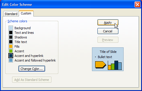
Click on the Edit Color Schemes… link at the bottom of all the color scheme samples, select the Custom tab, then click on each color swatch in turn and press the Change Color… button. Once again, select the Custom tab, and enter the sRGB values for each color into the Red:, Green:, and Blue: fields.
After setting the background color to 237 27 36, the obvious choice for Title text and Text and Lines colors would be 30 30 30, but that’s too much of a gray on top of they light blue background, so I deviated from the proper Pantone conversion and use true RGB black (0 0 0). The next choice is shadows. Since I’ve used true black for the things that will have shadows, I decided use the 30 30 30 dark gray for subtlety.
The last four colors in the scheme need to be chosen carefully, since they define not only fills and accents, but the first four colors used for charts, and the colors used for hyperlinks. The two critical ones are fills and hyperlinks, because these will be used the most. Since our color palette has two blues that are darker than the light blue background, these are natural choices for hyperlink (0 51 89) and followed hyperlink (100 160 200). Both will stand out from the background, without doing so in a garrish manner (as, say, red, green, or orange would). Using the orange (240 171 0) for fills and green (122 184 0) for accents rounds out our color palette.
Press the Add As Standard Scheme button so you can select the scheme from the list in the future, then press the Apply button to apply it to the current presentation.
Now we need to make a version of this color scheme for the title and divider slides, with a red background. Select the color scheme you just created, click on the Edit Color Schemes… link again, and repeat the steps above to change the background color to 237 27 36. Next, change the Text and lines and Title text swatches to 255 255 255 (white), and Shadows to 173 175 175 (Cool Gray 6). We’ll leave the rest of the colors in the red scheme the same. Now press the Add As Standard Scheme button to add it to the list, then press the Apply button, which is the only way to save the added color scheme. Unfortunately, it also applies the scheme to all slide masters, so we’ll need to re-apply the color schemes. But first, let’s clean up the color scheme palette.
To make it simpler for others to select the proper color scheme, you should delete all of the default color schemes, so only these two are saved with the template. Click on the Edit Color Schemes… link again, select the Standard tab, and then one at a time, select each of the other schemes and press the Delete Scheme button. When you’re done, press the Apply button. Now, to reapply the correct color scheme to the masters. Select either the Slide Master or the Title master, depending on which has the incorrect color scheme, then click on the down-pointing arrow next to the correct color scheme, and select Apply to Selected Masters.
The Shape of Things to Come
Yes, I’m well aware that after all of this work, we seem to have only accomplished making one blank red slide and one blank light-blue slide. Trust me, it was well worth the effort. With this solid foundation, we can now add the shapes and other elements with PowerPoint’s drawing tools, and design them such that they will interact with the underlying slide design and color schemes correctly.
The next elements I need to add to duplicate the existing Red Cross template are the white bar at the bottom of each slide, the Red Cross logo, and the red line between the gray and white areas on the content slide master.
Although I’m inverting how the white bar is constructed (as an element itself instead of being just the background), I can copy the red bar as-is from the original Red Cross template Slide Master to my new Slide Master. Since its location is copied during the copy and paste operation, this will provide a guide in sizing the white bar.
I went a step further in my tweaking, and replaced the solid filled shape with a 15 point line, mainly to ensure that its width doesn’t get accidentally resized when I or someone else is updating the design template. To get it to the same position, I had to adjust the grid (View > Grid and Guides…), disabling the snap to grid feature. I also enabled the snap to object feature, to make the next step easier.
Next, I created a filled rectangle, starting at the bottom left corner and ending at the right edge of the red line I just created. I changed its fill color to white, and then changed its ordering to the bottom of the display stack (right-click > Order > Send to Back). The snap to object feature (which snaps to the center of the line) ensures the white bar and red line will not have any gaps between them if the red line’s width is changed. This procedure also ensures the white bar has the same apparent height as the template I’m duplicating, and that the text areas (date/time, footer, page number, and any text boxes) appear on top of the bar.
I used the same trick to create the white bar on the Title Master—I copied the red rectangle from the original master and then used object snapping to create the new white bar, set its display order to the bottom, then deleted the red rectangle.
If you want to add a background gradient, texture, pattern, or picture, then now is the time to apply it. Select the Format > Background… menu, pull down the color-swatch drop-down listbox, and select Fill Effects… to bring up a PowerPoint menu I’ll bet you’ve never used. This is beyond the scope of my tutorial, but do remember that raster images look best when presented at their native resolution, or an even multiple scaled up or down, so choose or create your images carefully if you use a picture background.
Now our design template is starting to look like its finished form, but we’re not done yet.
Toe the Line With Vector Graphics
The next item I need to duplicate from the existing Red Cross template is the corporate logo. I can tell by its blurry appearance that the designer used a raster image. Since we can’t assume that this template will be used on only one resolution projector, and we don’t want to make one template for each of the possible projector resolutions (800×600, 1024×768, 1280×1024, 1280×720, 1920×1080, and the several funky variations of 16:9), the best way to make our logo look sharp when presented at all of these resolutions is to insert it as a vector image, so that PowerPoint can rasterize it at presentation time.
For presentations on Microsoft Windows operating systems, the best vector graphics format is EMF (Enhanced MetaFile). EPS images will only display their raster preview image in PowerPoint (the high-quality vector image will be printed, however), WMF (Windows MetaFile) images don’t support arcs or circles, and CGM files are uncommon, unwieldy, and probably have a few other issues I’m forgetting about.
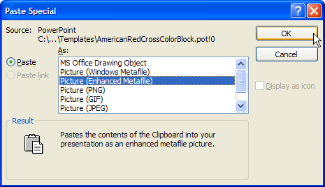
When inserting graphics, and especially vector graphics, it is best to use the Paste Special command, so that you can be sure PowerPoint inserts the right image format from the several likely to be in the clipboard. If you just use the normal Paste (CTRL+V) command, and especially with vector format images, PowerPoint will usually select the least-optimal format.
Adobe Illustrator does a fine job at converting its vector images to EMF (use the File > Export… menu item), but any graphics application that can paste artwork to the Windows clipboard in this format will work as well. You can either save your logo to an EMF file on disk, or copy it to the clipboard, and then from within PowerPoint, select the Edit > Paste Special… menu, and then select Picture (Enhanced Metafile) from the dialog box.
Again, I used the trick of copying the old logo from the original template to the new one, as a temporary positioning and sizing aid. I can then insert the EMF version Red Cross logo, resize it to match, and then position it exactly over the raster logo. To aid in telling the images apart, you might change the properties of the new vector logo to include a brightly colored outline. Once you’re happy with its size and position, use the Order > Send Backward right-click menu item to send it behind the raster placeholder. Then you can easily select and delete the placeholder, and remove the colored outline from the new EMF logo.
Raster as the Last Resort
If you do need to use raster images in your template, and you know in advance what resolution projector it will be presented on, there is something you can do to ensure the images are sharp. But it is tedious if you have more than a couple of images.
Select the raster image and then choose the Format > Picture… menu, then select the Size tab. Under the
Scale section, check the Best scale for slide show box, and then select the resolution of the projector. You should repeat this for every image, and because the dialog box doesn’t remember the result of this setting, you can’t use the dialog to determine if any particular image is already set to pixel-for-pixel display. And if you present on a different resolution projector, you will have to re-size each image.
Of course, this may make the raster images much smaller (or larger) than you desire. So you’ll either have to put up with the incorrect size, suffer a blurry image, or track down the original vector artwork, and rasterize it at a different resolution. In the latter case, of course, you might as well just save the vector image to an EMF file and gain all the wonderful benefits of vector scaling.
Multiple Masters
In PowerPoint lingo, Multiple Masters does not refer to typefaces, but rather, the ability to have more than one Slide Master, or Slide/Title Master pair, in each presentation.
This is handy, because although a basic presentation may only need the one design pair, the design template I’m improving uses a slight variation of the title slide as a section divider. At its core, it is the Slide Master with a red background instead of light blue. If this were the only difference, we could simply apply the Title Only layout and the red color scheme we created to any regular slide. But its title is centered vertically, instead of being placed at the top edge, and the white bar at the bottom has the same height as the bar on the Slide Master. So we actually need to create another Slide Master to store these properties in.
If you have left the Slide Master View, go back into it. Select the Slide Master, copy it to the clipboard, and paste it back. You’ll have another pair of masters, so delete the second Title Master. Select the second Slide Master (now orphaned without a Title Master), then delete the red line, the text box, and whichever other placeholders you don’t want on your divider slide and center the Title Area vertically. Finally, show the Slide Design task pane and apply the red color scheme to the selected master.
Fleshing Out the Template
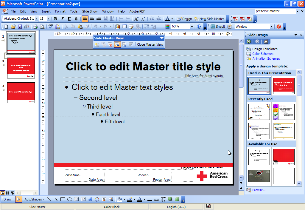
This is what the core of our template looks like, when seen from the Slide Master viewpoint.
With everything done up until this point, our Slide Master view shows the core design of our template. The left-hand pane shows one Slide Master/Title Master pair, linked together, and another Slide Master, without a linked Title Master. The right-hand pane, set to Slide Design, shows thumbnails of the two Slide Master designs available in this template at the top, followed by other designs available for use.
Up until now, I haven’t said anything about the several other text placeholders that our Slide and Title Master have. The default locations of the Time/Date, Footer, and Page Number boxes are probably in the way now, but it would have been hard to determine their position, size, and coloring before we had all the other elements in place. So delete the ones you don’t want (such as all of them for the Title Master), and don’t forget to change the font applied to the remaining ones—I’m just guessing, but Arial is probably not your favorite font.
You will also want to tweak the position and size of the text and title placeholders, to make sure that neither results in text that overlaps the other elements you have placed on the masters.
The last tweaks here are among the most important. Select either item in the Slide Master/Title Master pair, then on the Slide Master View toolbar, press the Rename Master button and give it a short but reasonable name. Select the other Slide Master, and give it the same name, with “Divider†appended. Naming the Slide Masters will make it easier to determine which one to apply when you or someone else is creating a presentation. Also, right-click on each Slide Master in the left-side pane, and make sure that Preserve Master is selected. This state will be indicated by a pushpin icon under the Slide Master number. This will stop PowerPoint from automatically deleting what it thinks are “unused†slide masters (which it will otherwise do in a few circumstances).
Now close the Slide Master View.
If your template has multiple slide masters, I recommend that you insert a couple of additional blank slides in your template. The existence of multiple masters in the template is not always obvious (it’s only apparent when you have the Slide Design task pane visible), and PowerPoint’s default action when clicking on secondary slide master is to apply it to every slide in the presentation. In my template, I inserted two additional slides—applying the divider Slide Master to the first, and the normal Slide Master to the second. This ensures that the existence of the divider Slide Master is visible, and that the next slide inserted by Insert > New Slide isn’t another divider slide (again, this is PowerPoint’s default action).
Slide Transitions and Animation Effects
If you desire to apply a slide transition, animation of the elements (such as each bullet point), or sound effects, you should also apply them to the Slide and Title Masters now. Detailed coverage of this is beyond the scope of this tutorial, but here are some general principles:
- Subtle, quickly applied effects are the best (i.e. “Fade in one by one†or “Fade in and dimâ€)
- Be sure to apply a transition to every Slide and Title Master, if you use one at all.
- Use transition sounds carefully. Most are annoying, and even the subtle ones can sound strange to the audience.
Instructions Included
Because many of PowerPoint’s features operate in counter-intuitive ways, and because most users are unfamiliar with many of the features (such as Slide Masters) needed to make high-quality presentations, you should include a few basic instructions and reminders as sample content in your presentation template.
For my improved Red Cross PowerPoint template, for example, I included the following text on two slides:
Using Templates
- To save for use select File > Save As… then from the Save as type choose Design Template (.pot) and press the save button. PowerPoint will save to the template folder.
- To use, select File > New… then On my computer… and select a template from the General tab.
- To make presentation start automatically, set Save As type to PowerPoint Show (.pps).
Making Presentations With This Template
- Use the “Color Block†Slide Master for the title slide and all the content slides.
- Use the “Color Block Divider†Slide Master for any section divider slides and the end slide.
- To create a divider or end slide, insert a new slide, select Format > Slide Layout, apply the Title Only text layout, then select Format > Slide Design, click on the down arrow on the red design template and choose apply to selected slides.
About this Template
- This template is formatted with the official Red Cross logo, fonts, colors, and bullets.
- Download the Akzidenz-Grotesk font at:
http://www.example.com/AkzidGrtskStdTTF.ZIP - Use Georgia for any serif-font needs.
- The Red Cross logo in this template is a vector Enhanced Metafile (EMF), so it will be crisp when shown on any display’s native resolution.
Test Everything
Before you go any further, save your template, close it, then start a new presentation using it, saving to a new presentation with the .PPT extension. This will be your first test of the template, and ensure that your experimentation doesn’t get applied to the template. This is especially important, because PowerPoint deletes the undo history each time you save the file!
Next, insert some normal content slides, a divider slide, and some more content slides. Flesh out each slide with dummy text, including bulleted lists, charts, and multiple URLs. Play the presentation, and click on at least one URL, leaving at least one other URL unvisited from within PowerPoint. End the presentation, save it, close it, then reopen it. This seems to be necessary in order for PowerPoint to determine which URLs have been visited.
Now, play the presentation again. You need to look at each slide and element type carefully. Make sure all the text, charts, and URLs are as visible as you desire. Some combinations of color schemes and animation effects can render your text or other elements nearly invisible. For instance, I discovered that the “fade in and out†animation scheme interacted with the hyperlink colors to make visited URLs in bullet items nearly invisible, once you display the next following bullet point.
If you discover any problems, make the necessary changes to your template, and then repeat the test above to verify that everything is working correctly.
Go Forth and Present
Save the file, and go celebrate with the refreshing beverage of your choice—you have definitely earned it.
Don’t forget to promulgate what you’ve learned about PowerPoint templates with others. Put together a class for the company’s key presenters, and teach them how to use the new template properly.
Next, convert all of your corporate logos (and those of your business partners) to EMF and create an Office clipart library to contain them. Do the same with any other graphics that get used regularly. Vector art will almost always look better than raster art.
Finally, consider creating two templates—one for standard projectors and one for wide-screen projectors. The aspect ratios are different enough that you really do need to design the layout differently for each projector type.