U.S. Federal Highway Administration Has Fuzzy Vision
I’m a bit of a symbols geek, so I often peruse symbol standards and libraries. I’m continually frustrated by how poorly designed most symbols are, but what really galls me is when their quality and accuracy is degraded for no good reason.
Such is the case with the U.S. Department of Transportation. The department’s Federal Highway Administration designs all of the symbols and signs used on our nation’s roads. These standards are contained in the Manual on Uniform Traffic Control Devices (MUTCD). The manual carefully defines the shape of all the signs, and specifies their colors via the Pantone Matching System.
Pantone colors are specified as printed ink colors (combinations of Cyan, Magenta, Yellow, and blacK), not as light (combinations or Red, Green, and Blue), and are not always compatible. Though a 1:1 mapping between PMS colors and RGB colors can be had if you specify the color space as sRGB, not all colors are represented faithfully, and any conversion needs to be done with all software packages and layers within the software being designed for such a conversion. It’s quite complex.
Then there’s the issue of smoothness and scalability. Computer screens and many image formats (PNG, JPEG, GIF) display images using raster (regular grids of dots), and as such, these images show their pixel boundaries when scaled, and become either very blurry or very blocky, and are unable to capture details smaller than a high multiple of the pixels.
So the MUTCD is published as a PDF file, which can easily store images and text using PMS colors, and retain the vectors from the original designs, preserving nice smooth curves, and nice sharp text.
So what is the agency’s official recommendation for “How To Extract PDF Images” from the MUTCD, so they can be used elsewhere? Essentially, it’s take a screenshot! They are even so bold as to acknowledge (one of) the inherent problems with this approach, and state, “Note:Â To obtain a sharper image, please try enlarging the figure by increasing the magnification of the original page.”. This is the page that’s linked to the PDF index.
Elsewhere, the agency actually provides individual EPS and PDF vector drawings for some, but not nearly all, of the images in the MUTCD. No Adobe Illustrator or SVG images are available, nor even the most obviously best format, a symbol library in Adobe Illustrator and Inkscape formats.
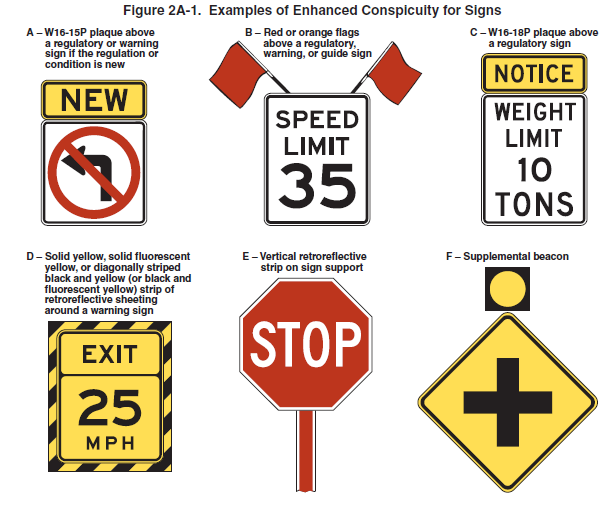
For example, among these very important signs…
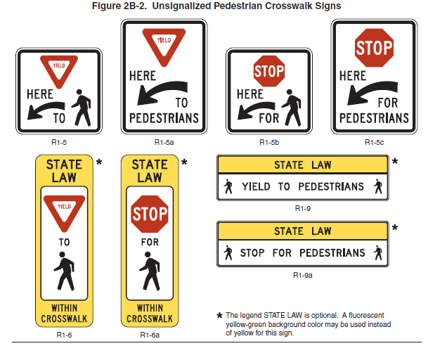
…only the primarily text signs (R1-9 and R1-9a) are available in vector EPS/PDF format on the MUTCD website.
These symbols are developed with your tax dollars, so are therefore in the public domain, and should be free. But if you want such a symbol library, you have to buy them from a third-party company, who charges so much for the library that they don’t even list the price (price in U.S. dollars is marked as “Call for Pricing”).
In searching for alternative sources for vector versions of these signs, I came across TrafficSigns.us, and was pleasantly surprised, until I opened one and saw:
Sign image from the Manual of Traffic Signs <http://www.trafficsign.us/>
This sign image copyright Richard C. Moeur. All rights reserved.
No, you can’t copy content published by the Federal Government and slap your own copyright statement on the material. In addition, it’s 2017, yet the site’s homepage still indicates that the author is still in the process of “adding signs from the 2009 MUTCD”. Anyone who relies on this site runs the possibility of using a sign that’s 8 years out of date. For instance, his page Standard Sign Typefaces still describes the modern sign typeface Clearview as being under development, and authorized for use by the FHWA. The font’s interim approval from 2004 was rescinded in 2011, so this advice is now wrong.
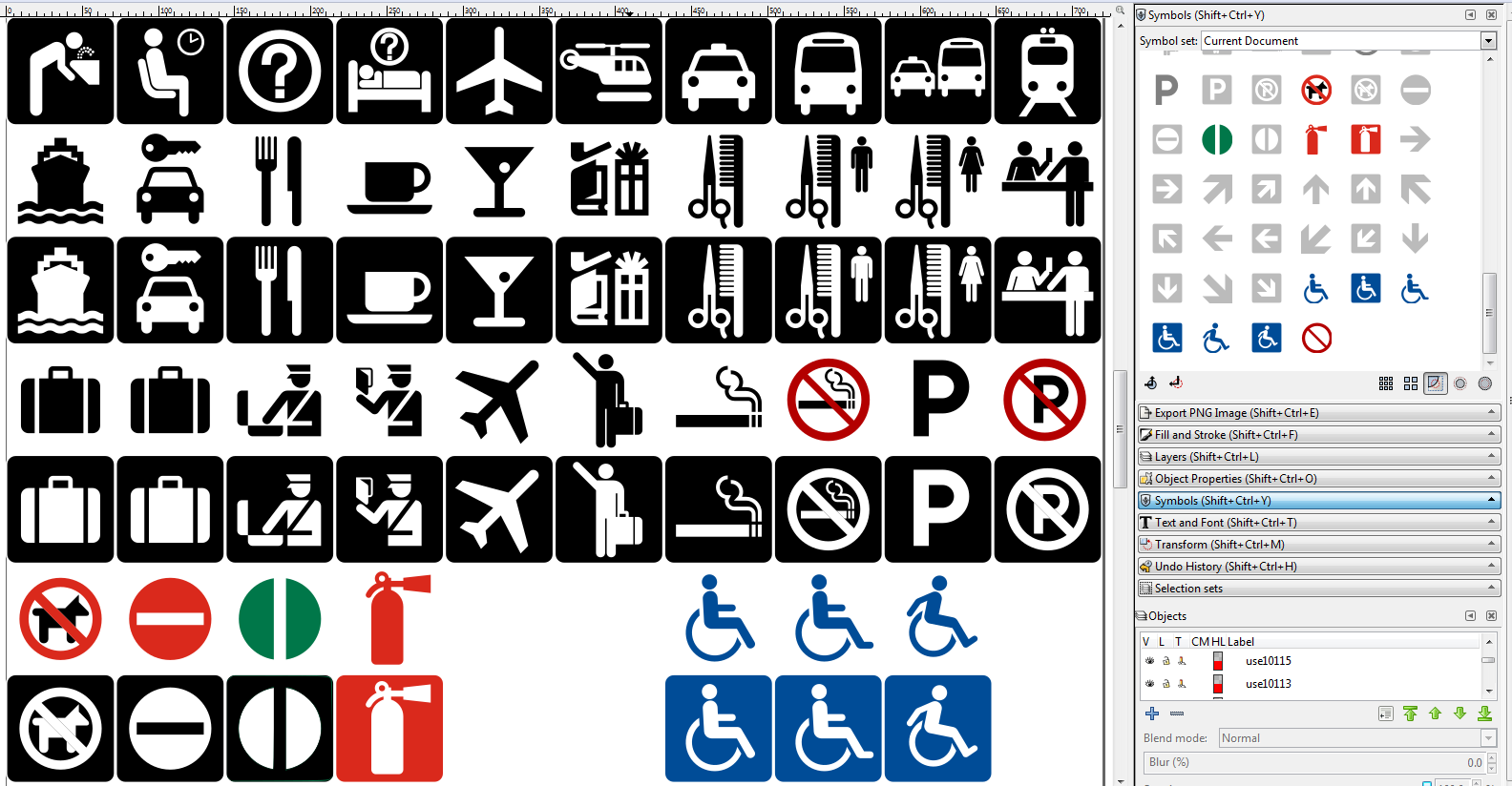
Yet not even simply having a symbol library available in vector drawing programs is enough. Take, for example, the AIGA Symbol Signs library in Inkscape. Probably copied directly from AIGA’s vector collection, both sets consist of black-only symbols. For most of them, that’s appropriate. But several symbols are based entirely on ISO symbols, which have a defined color. AIGA’s No Smoking sign, (based on ISO 7010:P002) for instance, the black prohibition sign should be red instead of black, and in particular, the red specified by ISO 3864.
ISO no-smoking sign:
AIGA no-smoking sign:
Which one catches your attention the best? Yep; I thought so.
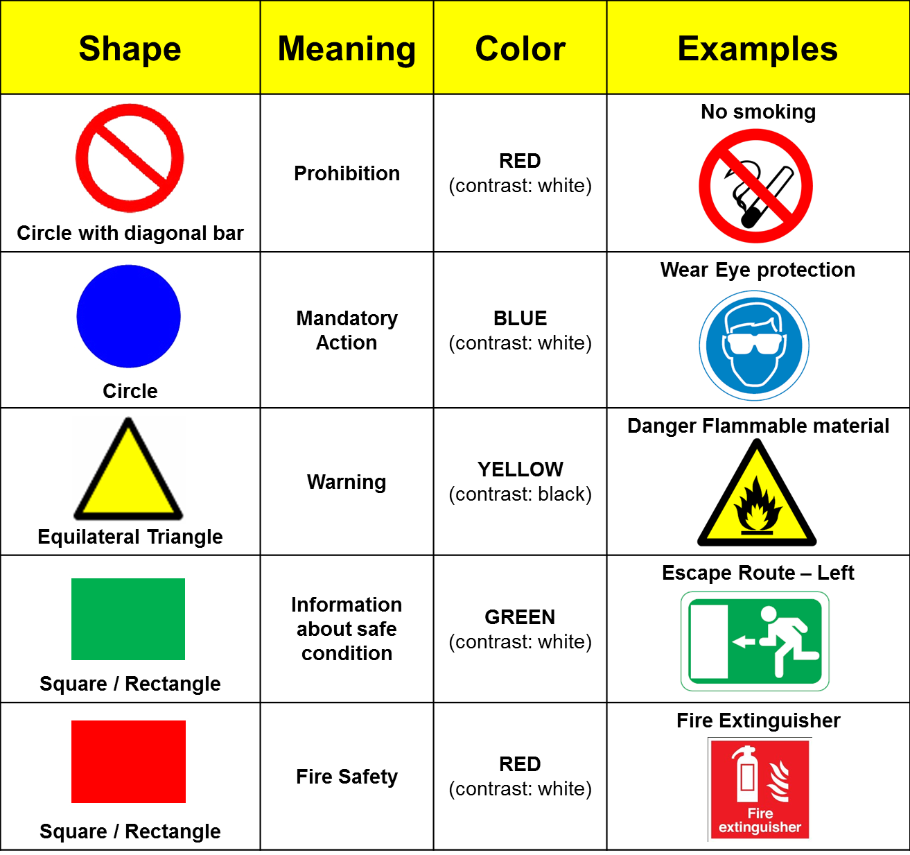
This is extremely important, as the combination of shape and color has well-defined meanings in the international system of safety signs. The best chart I’ve ever seen for this appeared in a Quora answer by Murali Krishnan:
 Converting the ISO 3864 colors to Pantone, CMYK, and sRGB is difficult, because a) I don’t have a copy of the standard at the moment, and b) my recollection is that it was specified in a color space not easily converted to the commonly used print and digital color spaces. Several sources disagree in what that conversion is. According to this, the closest match for red is Pantone 485; for orange, it’s Pantone 152; for yellow, it’s Pantone 109, and for blue, it’s Pantone 2945. The ANSI Z535.1 Safety Colors agree with this, adding a “C” to indicate clearly it’s the Coated version of the color, and a few other colors we’ll use in a minute: Safety Purple is Pantone 253 C; Safety Brown is Pantone 168 C, and Safety Gray is Pantone 430 C (yes, it makes a big difference with color what the surface finish is).
Now that we’ve got a list of Pantone colors, we can map them to sRGB, so ISO safety red becomes 218,41,28 (DA291C in hex); ISO safety orange becomes 229,114,0 (E57200 in hex), ISO safety yellow becomes 255 209 0 (FFD100 in hex), ISO safety green becomes 0,119,73 (007749 in hex) and ISO safety blue becomes 0,76,151 (004C97 in hex).
So now we can go colorize all of the symbols AIGA forgot to color in their symbol library.
First, we’re going to colorize the first-aid sign, since without color you can’t tell if it depicts the Red Cross (red cross on white background), the Swiss Flag (white cross on red background), or first-aid (defined by ISO as a white cross on a green background).
Next, we’re going to colorize the no-smoking, no-parking, and no-pets symbols (but leave the inverted white on black chickletts alone, because I can’t quite figure out what to do with them).
That the next pair should not be colorized by the AIGA is very curios, because I happen to own the AIGA book describing the development of these symbols, and in it, the no-entry and exit symbols are colored red and green, respectively. The no-entry symbol is routinely used on traffic signs, the outside of exit doors on commercial buildings, and on parking garage signs, to keep pedestrians and vehicles from going in through the exit. Yet in my entire lifetime, I’ve never seen the AIGA exit sign used, except in one place (the parking garage on the Stanford University campus closest to the engineering library…). Instead, you will see a black or white arrow inside a green circle. But that’s not defined in any symbol standar I’m familiar with! So we’re going to color the no entry sign with ISO safety red (just as it is in the United Nations Convention on Road Signs and Signals (C, 1a).
Next, we have the fire extinguisher symbol, which according to ISO standards, is either red on a white background, or white on a red background.
The last symbols to be colorized are the accessibility signs (loosely modeled after the International Symbol of Access, which is used by the MUTCD). Although white symbols on a blue background are reserved for mandatory action signs in the ISO standards, this use is actually codified in the ISO 7001 standard.
And this is where I run into a big wrinkle. Inkscape’s symbol library features are very poorly documented and still confusing once you find the right wiki page and the bug report it links to saying the wiki page is wrong. Editing an existing symbol in this library is very difficult! My first attempt at colorizing the no smoking sign resulted in a black cigarette, red prohibition sign, and red smoke—with no way to separate the smoke from the circle/slash. And then trying to redraw the symbols that were wrong (the slash in the circle is the wrong width) or to separate the cigarette smoke and P from the prohibition sign made it clear that the method for restoring the edited symbols to their original position in the symbol library is either undocumented or impossible. And even then, once I tried to use the colorized symbols in a brand new drawing, they were all still 100% black.
But that’s another post.