The App That Won’t go Away
Apple’s prowess at making technology easy-to-use is unparalleled, but there are some areas where their products don’t live up to the smoothness we expect. For me, iTunes is one of those areas.
I had tired of a location-based discount app, and decided to delete it from my iPhone. But every time I thought I had killed it in iTunes, it remained on my phone after the sync that should have deleted it. The nature of this endless-loop will be obvious to some, but it breaks a cardinal rule of good design: “Don’t make me think.â€
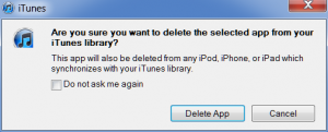
Here’s the first step:
So-far, so-good. The warning that this action will delete the app from my mobile device is important, appropriate, and what I desire.
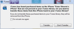
But when I sync my iPhone to iTunes the next time, I see this message:
This is where the confusion begins. The first problem is that the app I’m trying to delete was free (Mowingo, FWIW), so I don’t view it as “purchasedâ€.
Second, there is no list provided of what these “purchased items†are, so I have zero data on which to base my decision of whether to press “Transfer†or “Don’t Transferâ€. iTunes has not bothered to tell me a) how many items could fall in the bit-bucket, b) if they are paid or free, c) if they are music, pictures, videos, books, or apps, or c) the specific list of items. So I erred on the side of safety, and hit “Transferâ€â€”thus transferring Mowingo back into iTunes, where I had to delete it again.
This endless-loop occurred because I had installed Mowingo on the iPhone, not from iTunes, so it was recorded as being an item “purchased†on the phone, and thus subject to this nice but confusing warning. If I had installed it from iTunes initially, the loop would not have occurred.
To get out of the loop, I either had to delete the app from both the iPhone and iTunes, and then sync, or be absolutely sure that it was the only “purchased item†left on the iPhone and not in iTunes and then press “Don’t Transfer†on the next sync.
Neither of these choices results in a good user-experience.
There are three take-aways I wish to leave you with:
- Apple does not always execute completely on its design philosophy.
- All software and hardware designers need to think about how their logical thinking might be clear when viewed a step-at-a-time, but utterly freak their end-users out when the coded logic leaves the lab.
- That any company who thinks that it has to exit a market because Apple has too great a lead and can’t be surpassed should spend some more time thinking about what it takes to be great. And hopefully realize that all hope is not lost, that they might very well still have talent forgotten in the trenches that can out-think and out-design apple, if given the chance.


