
 The design of elevator button symbols is one of several instances where an industry has created symbology for its own use with little or no consultation with symbol design experts, integration with existing symbol conventions, and a complete lack of usability testing. The failure to perform such fundamental engineering design tasks is an epidemic in today’s engineering and product design culture, and has several serious consequences:
- It makes products with poorly designed symbols harder to use.
- It makes products with well-designed symbols harder to use because existing symbols have been assigned a new meaning by clueless designers, confusing the end-users.
- In some cases, it increases the danger to people because the existence or meaning of a safety directive has been obfuscated because of the first two problems, or outright failure to design symbols or controls that capture the user’s attention.
I must give credit for the spark that led to this analysis to Noah Guyot’s Hold that elevator! posting on The Cooper Journal. I had long wondered about the origin of elevator symbols, since they were mixing up several metaphors and seemed to have little in common with the well-established IEC/ISO symbols. Noah’s posting convinced me to find the root source of these buttons. Tracking down the origin was difficult, because the top (and medium, and lower-ranking) results of my searches all turned up the same thing—dozens of articles and blog postings—most with dozens of comments—all saying the same thing as Noah. The open/close door buttons are extremely confusing!
Out of the dozens of articles and blog postings I found about the open/close button design, none provided a reference to the specification with the symbol definitions (I found a once-removed reference elsewhere in a forum posting), and none of the dozens of comments on each article contained the correct answer either (two were lucky enough to guess, but neither of these were completely accurate or even sure of their guess).
Likewise, none of the people I personally interviewed could describe for me what these buttons really meant, and when I described their purpose (along with the mapping of one and two dings to the direction the elevator is heading) to an über- smart MIT grad I know, she stated that in her 45 years of riding in elevators, she had not come to understand their meaning, or even that there was a meaning intended by their design.
This simple issue is a perfect example of how the failure to use natural mappings, system design, established standards and design principles, and proper testing for usability results in an everyday item providing a universally bad user experience yet never being fixed.
Five Problems
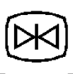
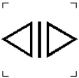
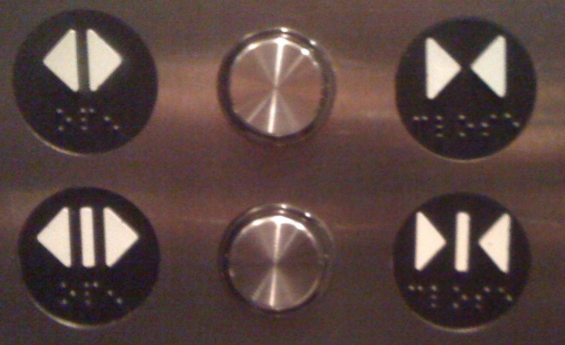
The first problem with the open/close door symbols is that they are hard for many people to differentiate. Perhaps this is because the arrows chosen by the designers are triangles, triangle-arrows are most commonly used for audio/visual controls, and despite the context, people are getting confused. Or perhaps it is because arrow shape does matter, as some studies have suggested, and the triangle arrow is perceived ambiguously. Or perhaps it’s simply caused by the lack of whitespace in these symbols. (My reading of dozens and dozens of comments I have read on the topic suggest it’s a combination of these latter two issues.)
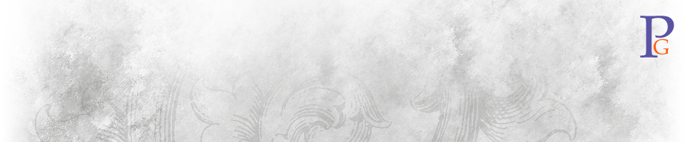
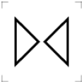
The second problem with these symbols is that nobody (99.999% of the public) understands the difference between the symbols with and without the vertical line between the arrows. The closest metaphor people are familiar with is the similar vertical line in the skip to next track/chapter buttons on audio and video playback devices. (Ignore for the moment the additional complication that the actual use of these media control buttons does not quite match their official definition.) In elevators, this vertical line does not mean stop or skip–it simply refers to the front doors of the elevator–the buttons without the line are supposed to open or close the rear or side doors. There is no natural mapping between the location, position, or the vertical line in these symbols and the concept of front/rear-or-side. A simple consult with Don Norman would likely have resulted in a design that would actually work.
The third problem is hinted at by the first two–the elevator button symbol designers did not base their designs on the existing IEC/ISO symbol sets or symbol design procedures, and based on the widespread confusion their symbols have created, did not test the symbols they designed for comprehension (procedures for this are well-defined by IEC/ISO). Had they done so, they would have chosen an arrow type that is defined for motion and used for this purpose fairly consistently, would have discovered their original design was confusing, and may have even eliminated the front/rear designation. Which leads me to problem #4:
Perhaps most fundamentally, the decision to create separate buttons for opening the front and rear doors indicates a lack of system design thinking. This is interrelated with the natural mapping issue–if an elevator has two sets of doors, how is someone riding the elevator supposed to determine which is the front and which is the back door? There is no obvious indication, especially in elevators where there is a control panel at both sets of doors. But even more importantly than that, most elevators with double doors allow only one set to be opened at a time, so why do you need two sets of buttons? And in the case where both sets of doors could be opened at any particular landing, why shouldn’t the one door open button open both sets of doors?
Ahh, but what about the door close button? Here is the likely reason why the elevator engineers designed two sets of buttons. If you’re standing at the front door, and decide to press the close door button, but your lack of eyes on the back of your head causes you to miss someone boarding from the rear, the result may be painful (for them), or perhaps even dangerous. The elevator standards documents are silent on this safety-design problem; they simply define the two sets of buttons and expect the elevator designer to understand all these unwritten rules and problems.
The fifth problem is that very similar symbols are already defined by IEC and ISO for very or fairly different things:

Real-World Examples
Once I learned the meaning of these buttons, I was able to do some real-world research that provided some key insight:
- The elevators at the Millbrae (California) BART/Caltrain station have double-ended doors, but use only the front-door open/close symbols, which works because only one set can be opened at a time, so this obviates the need for different front/rear door buttons. although curiously, there is a control panel at each end, and a mini panel in the middle with only the door open/close buttons.
- The elevators at the San Mateo (California) Main Branch public library are inconsistent in their use of the open/close buttons. The interior elevator is double-ended, but like the Caltrain elevator, uses only the front door open/close icons. But the parking garage elevator includes all four open/close buttons, and is perhaps the best example of the directionality problem. One set of doors opens to the front of the library, facing the street. This should naturally be the front of the elevator, but that door is opened by the “open/close rear/side door” buttons. The “real” front of the elevator faces the back of the building, but appears to be the front when you enter it from the parking garage (at least the first level; I didn’t check to see if it opens a different end on other levels)
Standards for Elevator Symbols
These are the two key standards that relate to elevator button symbols. They are difficult to find because the ASME standard which describes the appropriate use of the symbols relates primarily to safety and the organization has little other business with symbol design; and the ANSI standard that actually defines the symbols is concerned almost entirely with accessibility for those with disabilities. These are the last places I would have expected to find symbol standards, and were in fact the last place I did look.
- ASME A17.1/CSA B44-2007—Safety Code for Elevators and Escalators ($265)
- ICC/ANSI A117.1-2003 Standard and Commentary—Accessible and Usable Buildings & Facilities ($51)
But ASME/CSA/ICC/ANSI developed and specified these symbols in isolation. Apparently, none of them consulted enough of the existing collections of symbols to understand the rules and testing requirements. My evolving page on Symbol Design Standards details the collection of documents one must be familiar with in order to have a good sense for what shapes and symbol designs already exist, and which ones are likely to convey the intended message. Purchasing and reading the entire $11,000 collection might be enough punishment for a product designer who puts the “advance one frame†symbol on the “open door†button on a microwave.
Alternative Symbols
A few have designed their own door open/door close symbols, but none have done so according to the standard design principles, and none have claimed they did any testing on them, but they still seem to be better than the originals:
- Hold the Elevator Buttons (by Mathew Flickinger)
- Dave’s Million Dollar Idea
Mass Confusion
For those curious about the extent of the confusion these symbols cause, here are some of the articles I read during my research:
- Usenet posting by Richard Maurer
- Elevator Open, Elevator Closed (by Geof Huth)
- Hold that elevator! | The intuitiveness of symbols
- Elevator control panels
- Wikipedia reference desk discussion
- Photo of the day: Elevator button or fire alert?–while slightly off-topic, this serves as another example of how the same group that designed the open/close buttons screwed up a control panel with only one operable button on it.
2 thoughts on “Elevator Button Symbols—Open, Close, or What?”