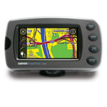
Road-Trip Results in Retro UI
Preparing for an unplanned road trip tomorrow, I pulled my old GPS out of mothballs, and was instantly transported back to 2003.

The Garmin StreetPilot 2650 may be old, but will continue to work for many decades, I’m sure (thanks to the FCC killing LightSquared’s hair-brained idea). I bought it a few years ago, after it was already discontinued, even though there was a newer model with Bluetooth and a better UI, specifically because I needed a model that still supported NMEA out over a serial port, and the newer ones simply can’t output a standard GPS sentence if the survival of their transistors depended upon it.
But I had forgotten just how backward its UI is until I tried to program in a simple 1.5 mile route from home this morning, and it took almost as long to figure out how as it did to drive there. (It might have actually taken longer—I didn’t actually time it.)
The UI is beyond bad. Yes, it has four large buttons that are easy to press even while driving and wearing gloves. But the primary interface is the small touch-screen, which uses Windows-style list boxes and scroll bars to select options. And when your search for a chain store results in multiple hits, the list of results does not include addresses, so figuring out which of the several is your desired destination is impossible.
The first part of this weeks moral, thus, is that no matter how bad today’s UIs might be, we need to remember that they could always be, and indeed once were, much worse.
Many of you are about to tell me that I should just be using a smart phone instead, and that Apple’s mapping and navigation solution (or the enhanced navigation apps) are where it’s at, and offer a superb UI.
You would be wrong in such a statement.
I met an old friend for lunch today, and when he texted my iPhone, wanting to know where to meet me, I simply tapped over to Contacts, looked up my contact for the establishment, and hit share via SMS. To which he responded, “Sweet.” When I saw his iPad windshield mount after we finished lunch, I assumed that all he had to do was tap on the vCard and hit navigate to. (I was wrong.)
Here’s the rest of the story.
First, sharing the contact with him was only easy because i happened to have both my location and his contact info in the Contacts app. Had I not had both already there, it would have taken me several minutes to do so. Since there is no way within Messages to insert a vCard object, I would have had to either a)memorize his phone number, and type it in once I got to the map application, or b) Add the contact and then navigate to the map app. Then look up the location, hit Share Location, and then search for the contact I just added.
This is not easy enough. I should be able to insert a vCard or other object directly into an MMS message, without having to jump through all these hoops. After all, I can insert a photograph into an MMS message far more easily than I can a location or someone else’s phone number.
Making something easier does not mean that you have made it good enough.
On the receiving end, it became even more interesting and convoluted. When I asked my lunch guest how many other people had ever texted him a vCard with an address as an answer to the rendezvous location, he naturally admitted it was a tiny number. But when I said, “So you just opened my message on the iPad, clicked the vCard, and said navigate—cool!”, he corrected me, and replied that the said MMS went to his iPhone, so he still had to manually type in the location.
Into an iPad 2 with 3G and iCloud account. But a different iCloud account than his iPhone. You see, he has four different iCloud accounts for his various business and personal activities. (There is nothing wrong with this, except for the fact that Apple’s programmers don’t want you to do that.)
And here is one of the design errors in the i*.* universe. None of Apple’s iDevices have IrDA ports for beaming vCards and other things around, nor can they even use the same protocol over Bluetooth (OBEX Push). Their in-the-box thinking is that because they don’t think this is the right way to exchange information, they simply design their universe to make it impossible.
Blech. What if I’m riding shotgun in his car, and want to send an address from my phone to his nav unit? OBEX Push (over IrDA or Bluetooth) should be the most pervasive way of doing this, and would be the easiest, IMHO. And I got this very scenario to work a few times with navigation units in store demos nearly a decade ago. Why can’t it work today?
And that’s the second half of this week’s moral. Just because you, as a designer or programmer, think your concept of how people should interact with technology is superior does not mean that you should deprive your customers of lesser (but more interoperable) methods.

